Properties Panel
Each circuit element has some properties associated with itself which are displayed in the PROPERTIES panel. Besides including different parameters for creating multi-bit circuits, it also includes parameters for annotation. the circuit schematic can be annotated by:
- Adding labels across different nodes.
- Including text boxes for displaying the version number, date, amendments and different group members involved.
- Adding rectangular boxes for highlighting different sections for complex designs.
While Figure 3.13 displays the properties associated with an AND gate, Table 3.7 lists the different properties available within the CircuitVerse simulator for different circuit elements.
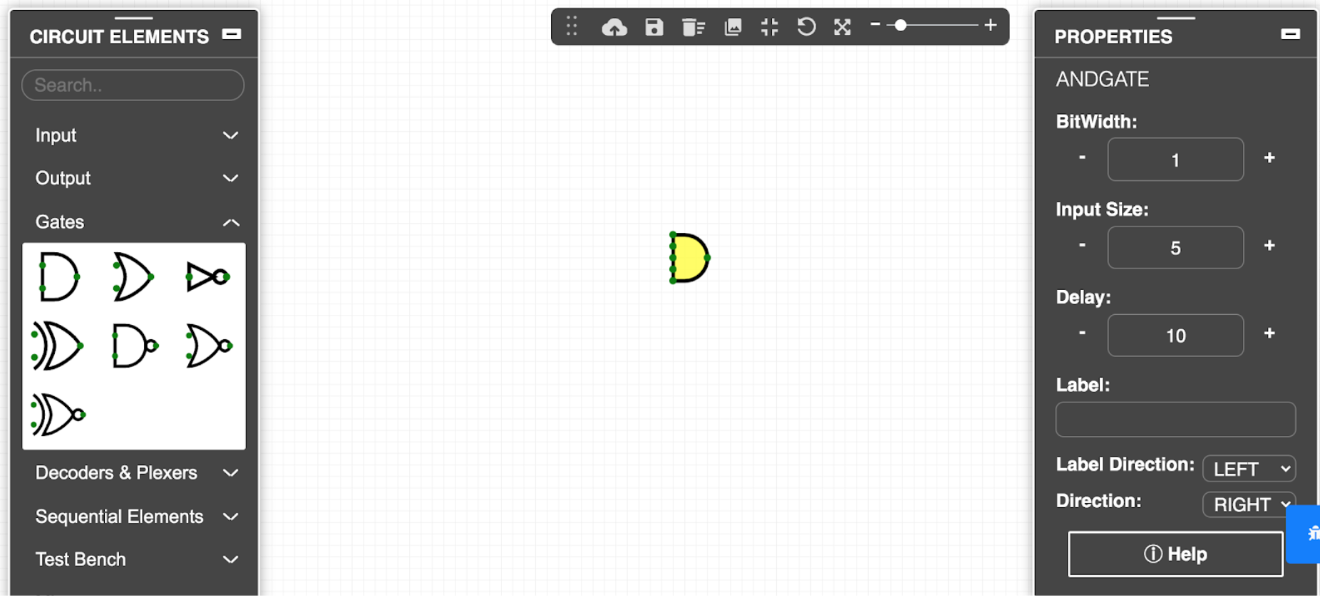
Table 3.7: Brief description of the different properties available for different circuit elements
| Property Parameter | Description |
| Project | Defines the project name that will be displayed in the menu bar |
| Circuit | Identifies the circuit tab that the user is currently working on. |
| Clock Time | Toggles the output value at a regular interval. While the default value is 500 ms, the clock interval can be increased or decreased using the stepper. |
| BitWidth | Specifies the bit width associated with the selected input or output circuit element. The bit width numeric stepper changes the bit width size from 1 to 32. |
| Delay | Displays a delay slider to add propagation delays.The delays are simulated; but they are virtual and therefore not rendered. |
| Font Size | Displays a stepper to increase or decrease the font size. The default value is 14. |
| Input Size | Specifies the input size of the selected circuit element. |
| Label | Adds a label for the selected element. For most of the circuit elements, the label can be further positioned using the Label Direction property. |
| Label Direction | Sets the position of the label for the relevant circuit element. Users can choose the desired label direction value from the drop-down menu. |
| Pin Length | Displays a slider to set the pin length of the selected element. |
| Direction | Sets the direction of the selected element.* |
| Orientation | Sets the pin direction of the selected element.* |
| Buffer Size | Displays a slider to set the buffer size. Minimum value is 20. |
| Columns | Displays a slider to set the number of columns for the selected element. |
| Rows | Displays a slider to set the number of rows for the selected element. |
| TestBench Name | Displays the name of the test bench for the selected element. |
TIP*: The direction/orientation of the circuit element can be changed using the arrow keys.
Edit Circuit Layout
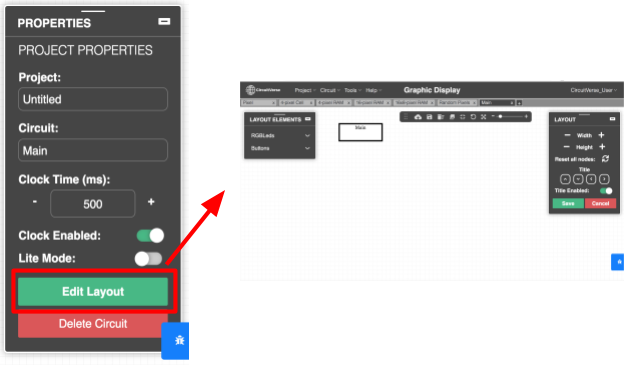
As shown in Figure 3.14, the Edit Layout button available on the PROPERTIES panel converts the circuit into a black box. The circuit elements and the relevant connections are hidden whereas the input and output pins are displayed (in the same order as displayed in the main circuit ).
As required, a user can use the LAYOUT ELEMENTS panel to add any circuit elements inside the subcircuit (black box), and the LAYOUT panel to edit the layout of the circuit. Refer Figure 3.15. Table 8 provides a brief description of the different settings available on the LAYOUT panel.
NOTE: Circuit layout must be edited before inserting a circuit or completing the wiring connections. If the node positions within the circuit layout are edited after making the wiring connections, then some of the wiring connections across different nodes or ports in the integrated circuit schematic may be lost.
TIP: Make all the necessary changes within the circuit layout prior to the wiring connections.
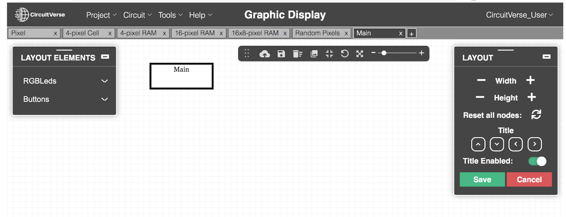
Table 3.8: Brief description of the different settings available on the LAYOUT panel
| Setting | Description |
| Width | Displays a numeric stepper to manage the width of the circuit layout. |
| Height | Displays a numeric stepper to manage the height of the circuit layout. |
| Reset all nodes | Resets the nodes to their default position. |
| Title Enabled | Displays or hides the title of the subcircuit. By default, the title is displayed for each circuit layout. |
| Title Position | Positions the title at a desired location using the up, down, right and left arrows. |